
Part of Living and Breathing Bitcoin (BSV).
Why I wrapped all of Creations in the reading look
I grew up reading paper books. Later I moved to eBooks, and these days, if I am honest, I read fewer books of any kind than I used to. But I still read a lot, and most of it on a screen: articles, essays, long threads that should have been articles.
What I have learned about myself is that I only enjoy reading on a screen when the screen gets out of the way. When it is just the text, and nothing is blinking at me from the side.
And I am picky.
How I like to read
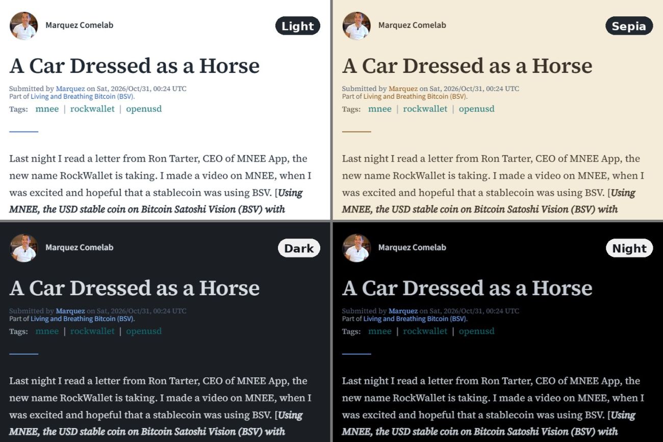
During the day I want a light page, white or a warm sepia, like paper. At night, when the lights are out, a bright white page feels like someone switched on the ceiling light in my face. Then I want it dark, the text soft and the screen dim, so that reading does not wake me back up.
It is not only the background. When I am tired, I want the letters bigger. Some days I am happy with a clean sans-serif; other days I am bored of it and want a serif, the kind of letter that feels like a printed book. Sometimes it depends on what I am reading. A short announcement reads fine in sans. A long personal essay asks for serif.
None of this is unusual. Anyone who has used an eReader knows these settings. What surprises me is how rarely websites offer them, even websites that exist for reading.
The building I live in
BSVSearch is a lot of things. There is a marketplace where people buy and sell items and freelance work, a directory, Web3 sites, ordinals, BSV-tipped content. I built all of them, and I think they are useful. But when I am reading, I do not want to see any of it.
When we released Creations last week, the article page already had its own quiet look: paper-like, one column, room around the text. The trouble was everything around it. You finished an article in that calm space, clicked back to the list, and you were standing in a busy hall again, with menus, blocks and things for sale. It felt like closing a book in a reading room and finding yourself in a train station.
A cocoon
So I decided to wrap a cocoon around Creations. When you step into Creations now, the rest of BSVSearch falls away, and what is left is text and the people who wrote it.
The Creations home page, the lists of articles, collections and writers, the Features, each writer's page and each collection's page now have the same reading look as the articles. At the top of every one of them is the Aa button, with:
- four backgrounds: Light, Sepia, Dark and Night;
- three typefaces: Serif, Sans, and Wide, a broad, open letter that some people find easier on tired eyes;
- three text sizes: Small, Medium and Large.
Your choice stays with you as you move from page to page, so you do not have to set it again on every article. Until you choose, the pages follow your device's own light or dark setting. The choice is remembered by the browser you are using, so if you read on a phone and on a laptop, you set it once on each.
There is a cost to this, and I chose it on purpose. Inside the cocoon you are less likely to wander into the marketplace or the directory. The BSVSearch logo at the top of every Creations page, and a slim footer under the lists and the writer and collection pages, lead back to the rest of BSVSearch for anyone who wants to go. The door is there. It just is not shouting.
Why not just use reader mode?
Most browsers have a reader mode that strips a page down to its text. I use it myself on cluttered sites. But it takes away the writer along with the clutter. What is left is text with nobody behind it.
On Creations, I wanted the quiet without losing the writer. Their world stays:
- the other work by the same writer, listed beside the article, and their writer page;
- the collection the article belongs to;
- a way to pay them: a tip on a free article, buying or subscribing for paid work, a licence if you want to reuse it;
- a way to hear from them again: follow the writer and get an email when they publish a new article.
Those are the things that take a reader from one piece to the next, and that let a writer be paid and be found again. Reader mode removes exactly those. The cocoon keeps them and removes the rest.
A space of their own
That is the other half of why I did this. I want every writer on Creations to have a place that is about them and their work, and nothing else.
Each writer has a page, in the same quiet look: their photo, a few words about themselves, their articles and their collections. It is not a profile lost in a busy website. It is a room of their own, with a link they can give to their readers.
Try it tonight
So here is my small invitation. Open an article on Creations tonight, tap Aa, choose Night, and make the text one size bigger than you think you need. Then read something slowly.
That is what I built it for.
Marquez
Tip the author
Free to read.
The creator allows this work to be used for AI training.